Client: Philip Morris International, IQOS
Our role: Leading role of Art Direction in UI/UX of Main website and assets
Year: 2018 - 2019
What is the hook?
Something from the upper class will always be attractive.
Special, unique, and exclusive, uhhh, sounds good?
Brand matters
As a crucial domain of IQOS society, the Club Logo shall be very identical and recognizable.
Of course, the hierarchy of memberships will be stimulating.
The more points collected, the more service offers. A classic marketing trick.

CASUAL AND JOYFUL
It shall be relaxed and offer an atmosphere of regardful and cheerful.
I was inspired by fashion and tech brands, which show products in a casual but direct way. It works perfectly after several rounds of UX and AB tests.
Challenge: Responsive layout took time on coding as there are millions of parallax and hovers. Other than that, the image pool has changed untold times.

MAKE THE RULE CLEAR
It is important to have a quick overview of which the current level of the customer is, and what it will be offered at this and the next level.

YES, NEWSLETTER
Don't like to be pushed? But I am afraid you will be addicted.
Challenge: This is tricky to make the content interesting in the very limited 640px width. No video, no transition. We designed several vector elements to make the visual friendly to your eyes.

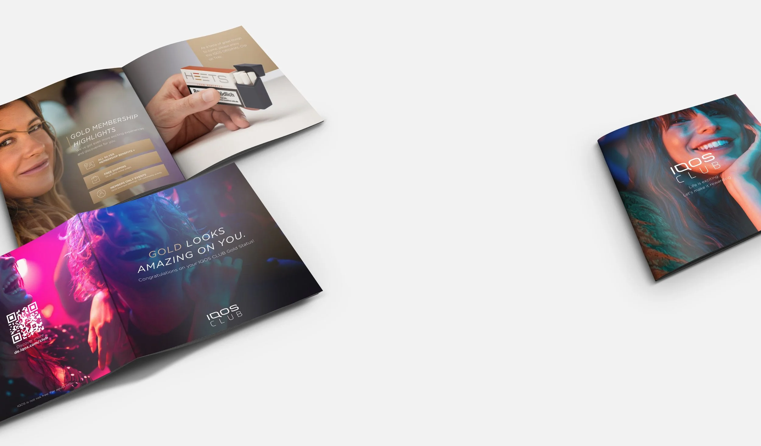
SOMETHING TO TAKE-AWAY
Would not it be nice to receive a printed brochure with your name in your post box? Also a holographic overlayed card with a promotion code.


